Hard to find your way
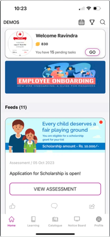
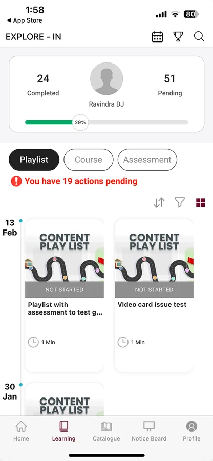
There was no clear way around. Feeds, banners and tasks shared one home, and pending work sat behind tabs, so users struggled to find what to do next.
Oust was built to help frontline workers learn and grow through courses, assessments, playlists and other learning formats. As the product evolved, however, the experience became harder to navigate, difficult to prioritise, and less engaging for the people using it.
When BetterPlace rebranded as GoBetter and Oust became part of the new Up-skill experience, we saw an opportunity to rethink more than the product's visual identity. We used the transition to rethink how learning was discovered, experienced and completed.
Oust helped frontline workers build skills through courses, assessments, playlists and contests, supporting more than 35 languages. It was designed for people learning alongside their everyday work, often away from a desk and with limited time for long-form learning.
Organisations used Oust to train teams across up-skilling, compliance, work processes and career development. That meant the product had to serve two sides of the experience: organisations driving learning and frontline workers completing it.
Frontline workers
Learning isn't their primary activity. It has to fit around the work they already do.

01
Oust was becoming Up-skill, creating an opportunity to rethink the existing experience alongside the new product direction.
02
As GoBetter expanded into new geographies, the product needed a more consistent and scalable experience.
03
Organisations were asking for improvements, while the existing experience had remained largely unchanged.
But the bigger question was: what was actually broken?
There was no clear way around. Feeds, banners and tasks shared one home, and pending work sat behind tabs, so users struggled to find what to do next.
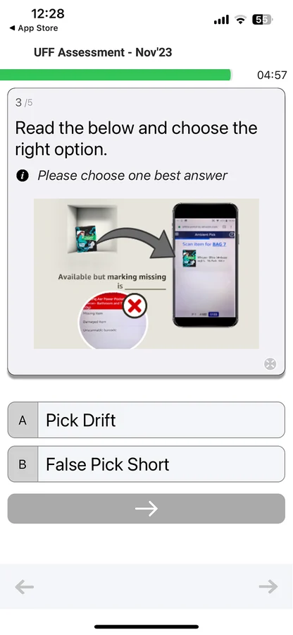
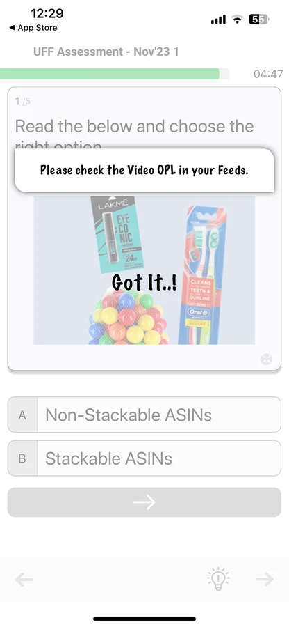
Patterns users knew from everyday apps were missing. Greyed-out answers, an unlabelled arrow and pop-ups over questions left them unsure what to do.
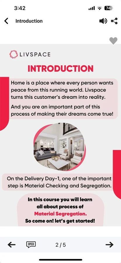
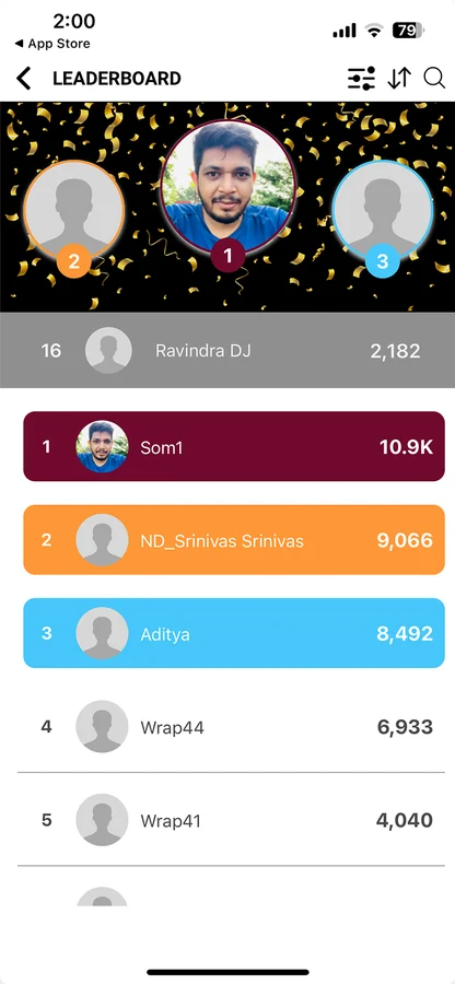
Organisations could restyle almost everything, so colours, type and layouts changed from one screen to the next.
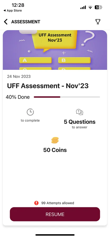
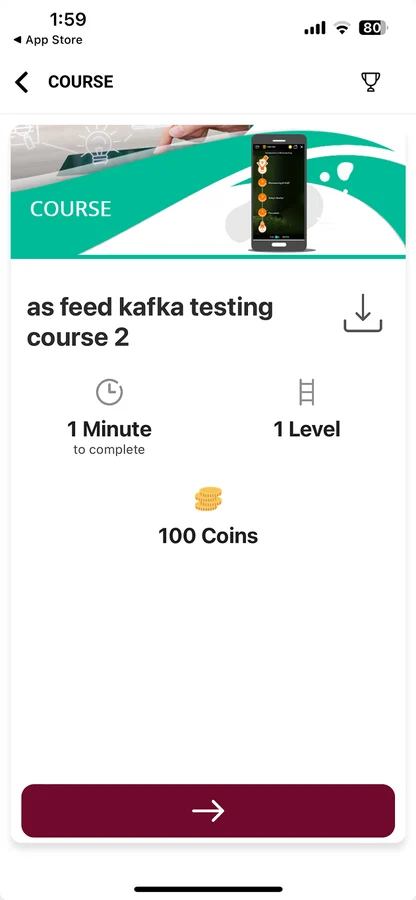
Sparse detail pages with small icons and a lone coin count felt old, and gave users little reason to start.
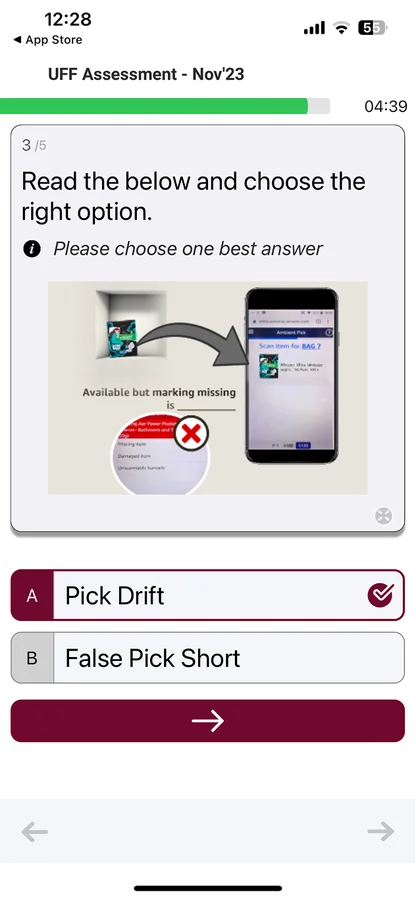
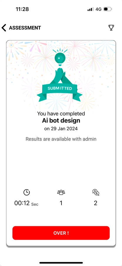
Feedback was minimal. A chosen answer got a small tick and results ended on OVER, with nothing to celebrate or come back for.
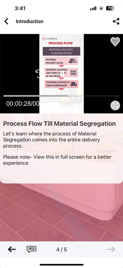
Misaligned elements, mixed icon styles and uneven spacing made screens feel unfinished.
The friction looked different on each side. Organisations struggled to drive completion and manage learning effectively, while frontline workers struggled to find, understand and complete what was assigned to them.
Admins
Driving learning was difficult.
01
Average completion was only 13-15%, making it difficult for organisations to ensure learning was completed.
02
Admins couldn't effectively surface critical modules, making it harder to drive timely completion.
03
Limited structure and guided navigation made content creation difficult, especially for first-time and recurring users.
04
An outdated experience and unclear guidance made it difficult for employees to understand what to do and why.
05
Flexible colour and CTA customisation could lead to inconsistent experiences and weaken brand identity.
06
For infrequent learning, asking workers to download an app created unnecessary friction.
Frontline workers
Finding and completing learning was difficult.
01
Important assigned modules weren't surfaced on the landing page, while learning content was primarily sorted by assigned date.
02
A cluttered, outdated interface and limited guidance made learning less engaging.
03
Resuming a module required users to navigate through the learning listing and filters.
04
Events and mandatory learning were difficult to discover, creating friction in finding what needed attention.
05
Courses, assessments and playlists lacked enough visual distinction, making it harder to understand what to start.
06
Assessments lacked clear instructions, hints and guidance for different question types.
07
Excessive customisation changed CTAs and colours, making interactions less predictable.
08
Long playlists and limited time made it difficult for users to complete learning.
The problems spanned the entire learning journey, from how organisations assign learning to how workers discover, start, continue and complete it. We focused on the moments where clearer guidance, structure and engagement could make the biggest difference.
01Assign
02Discover
03Start
04Continue
05Finish
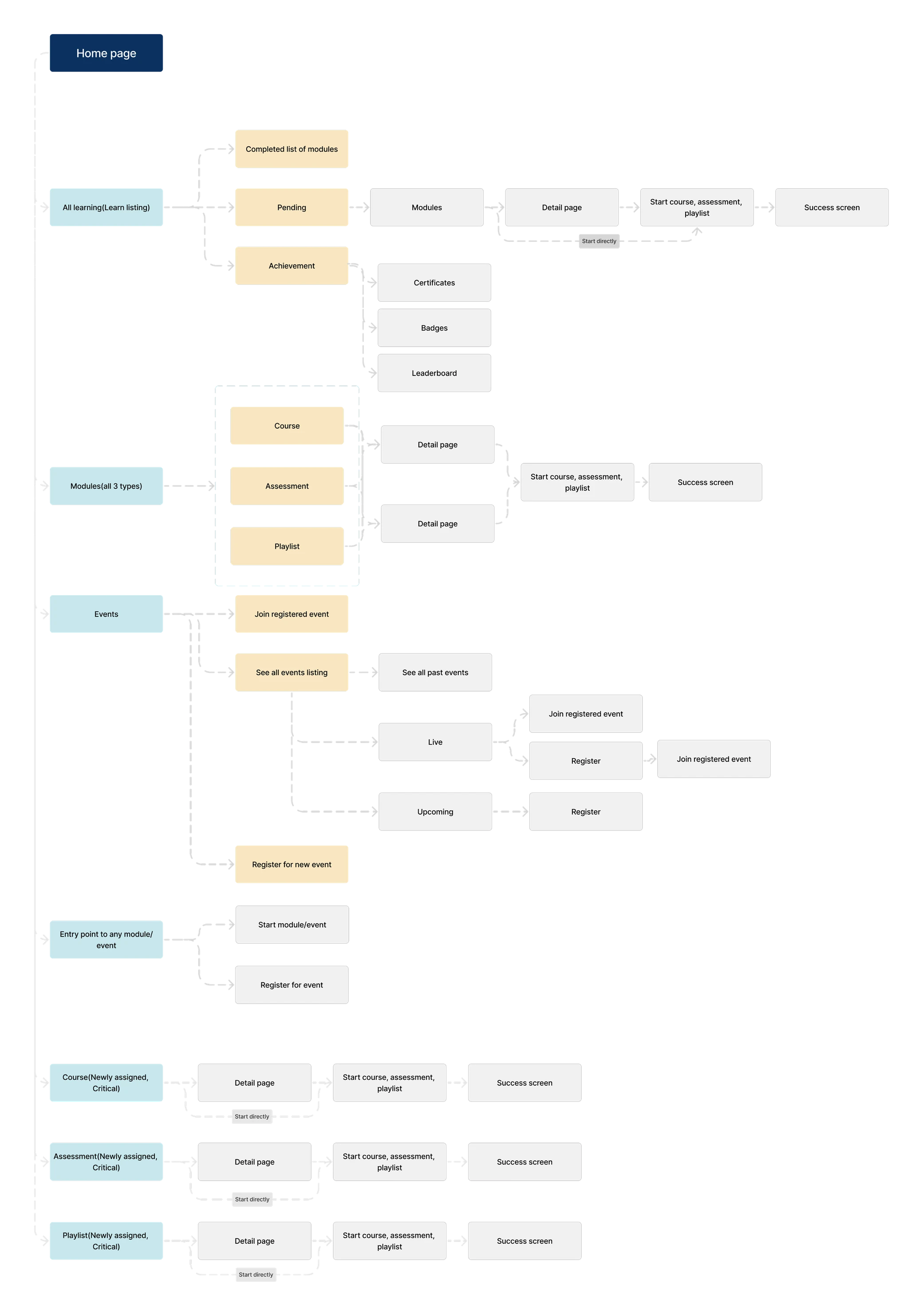
We anchored the redesign around the realities of frontline work, then translated those into clear design principles, a simpler information structure, and focused user flows.
We defined a set of design directions to make learning clearer, more engaging, and easier to complete for frontline workers.
We mapped the key moments across discovery, learning and completion to simplify the experience and clarify what users should do next.
A home experience that brings learning, progress, and what needs attention into one clear place.


Overall progress sits on top. It gives users a view of their own learning path and encourages them to finish what remains.
Clear, direct navigation to every independent module: mini courses, courses, assessments and playlists.
Whatever users need to accomplish is on top, in priority order, so the next task is always the first thing they see.
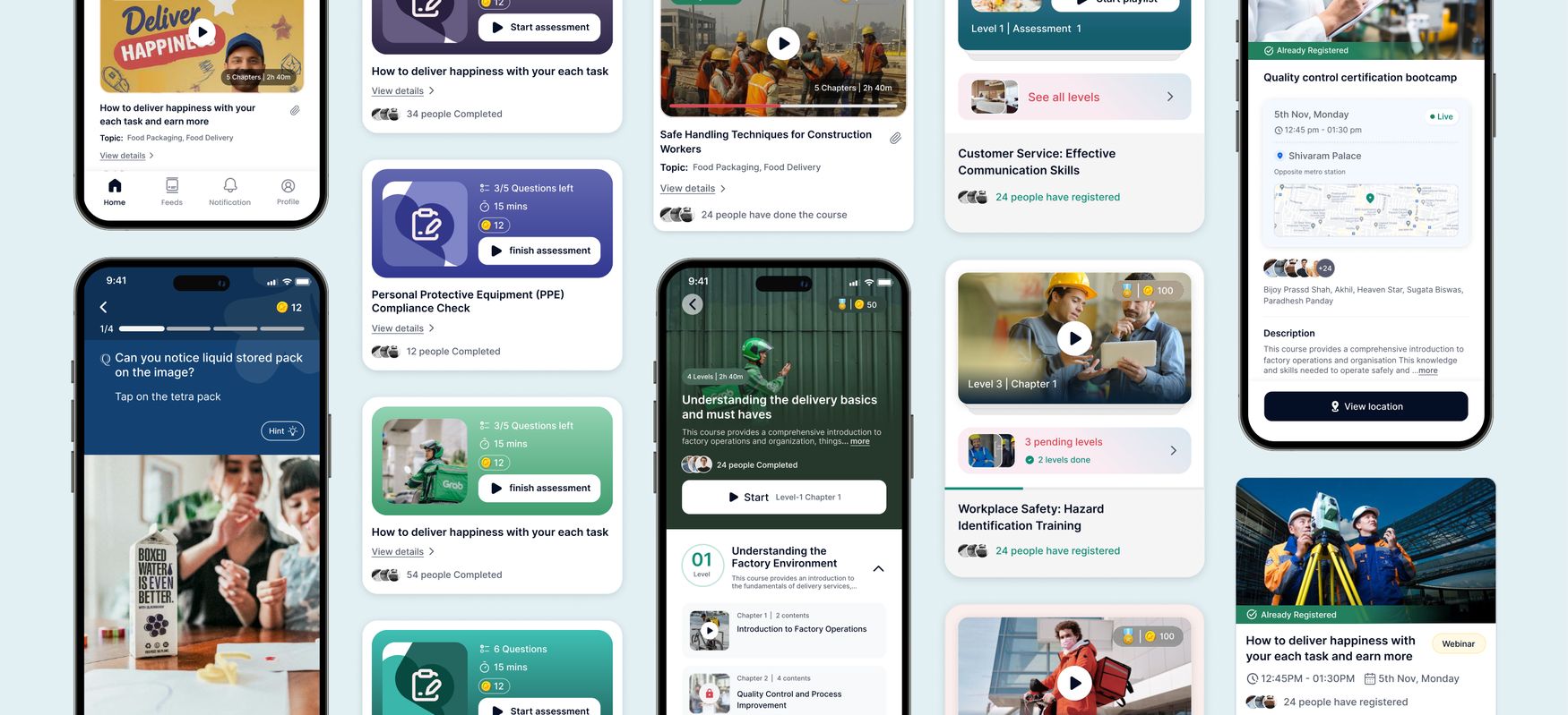
Each card guides users to one clear action, with visual cues, a prominent CTA and a strong visual hierarchy.
Assessments due soon show their questions, time and reward up front, with a single CTA to start.
Assigned playlists show the level and chapter a user is on, so they pick up right where they left off.
Courses combine video, images and audio across multiple chapters. We kept the experience familiar, with clear controls and a consistent way to move through each chapter.
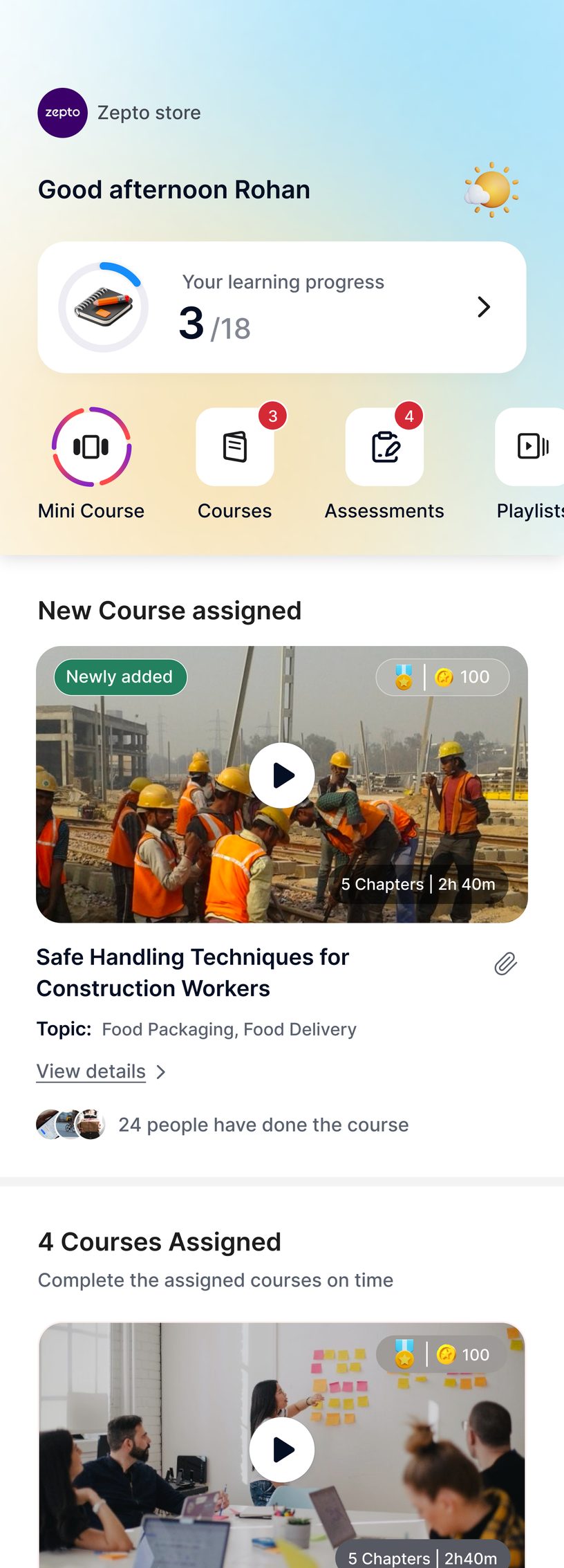

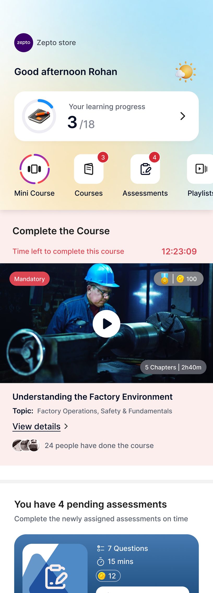
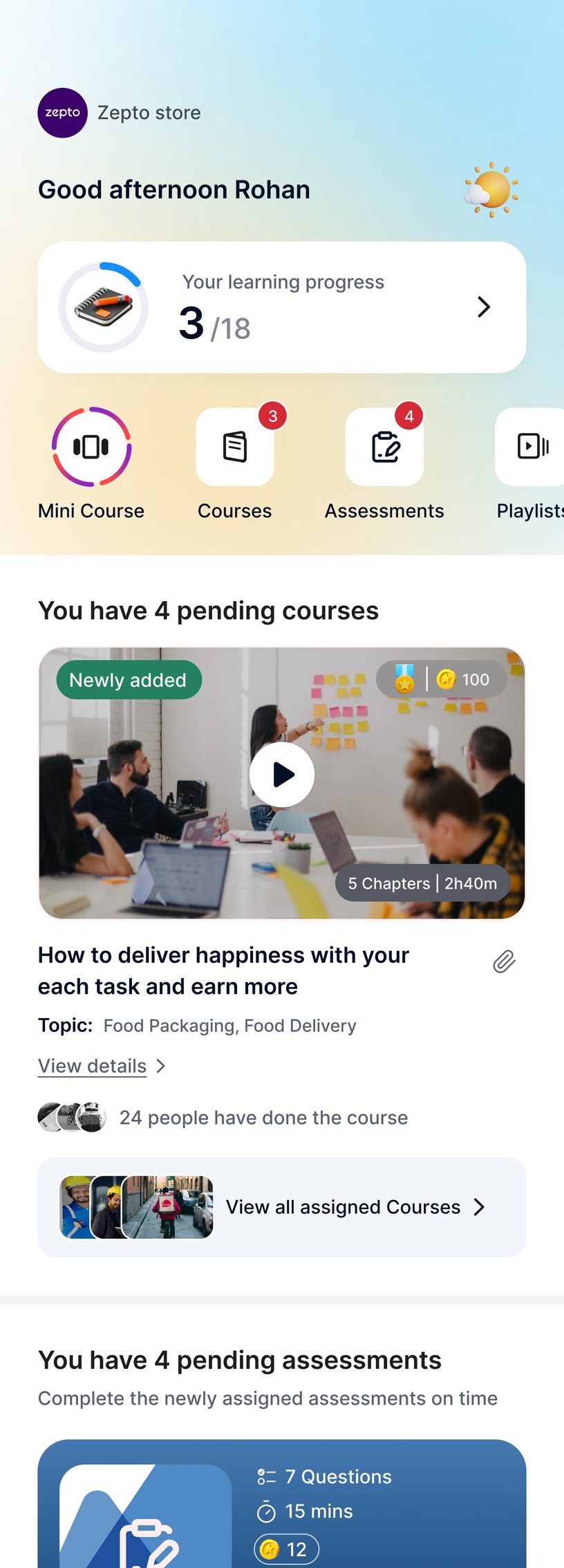
A prominent play button starts learning quickly, with View details for those who want more first.
A tinted banner and a running countdown capture attention and help users finish pending courses on time.
One course is highlighted and the rest stack behind View all assigned courses, so a long list never overwhelms.
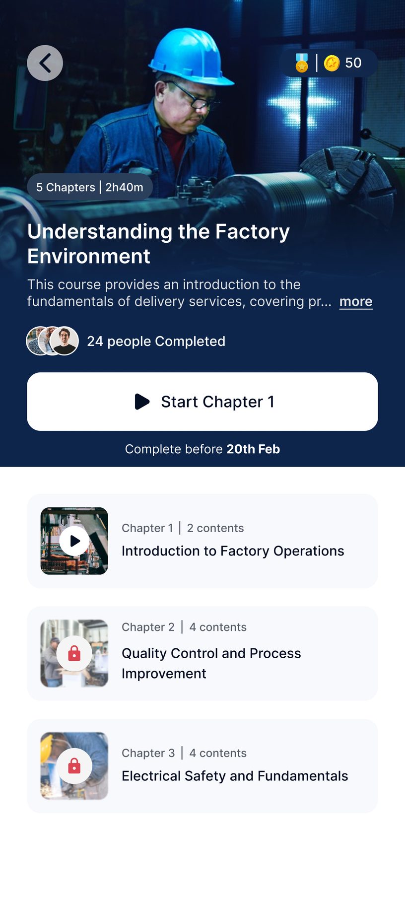
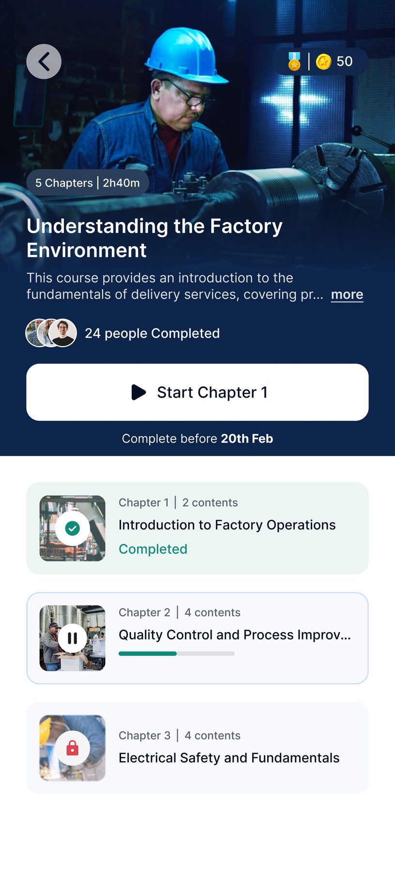
The top of the course page gives a clear overview, with one prominent CTA and the deadline right under it.
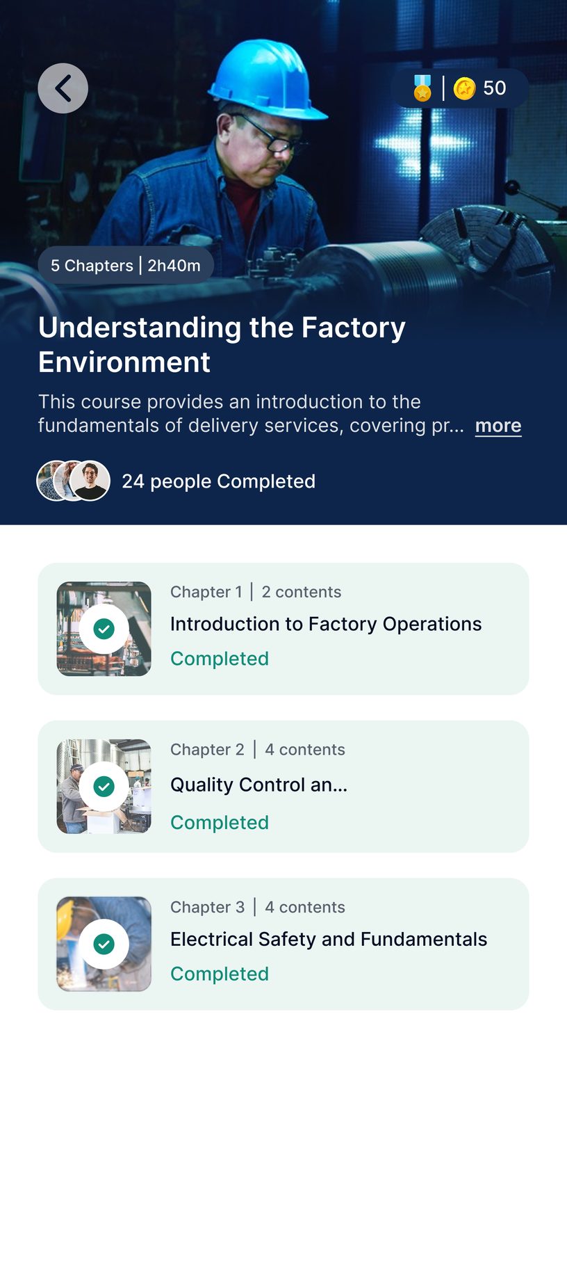
Each chapter shows whether it is locked, in progress or completed, so users always know where they stand.
Once every chapter is complete, the CTA steps aside and the page becomes a record of what was finished.
Courses support video, text and audio, with flexible ways to move through the content.
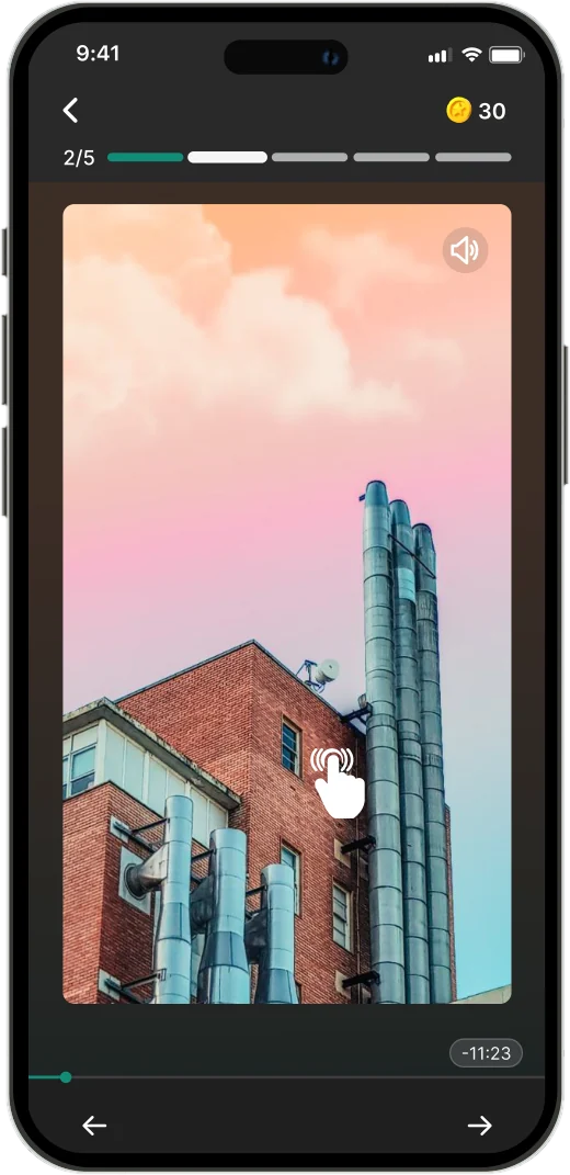
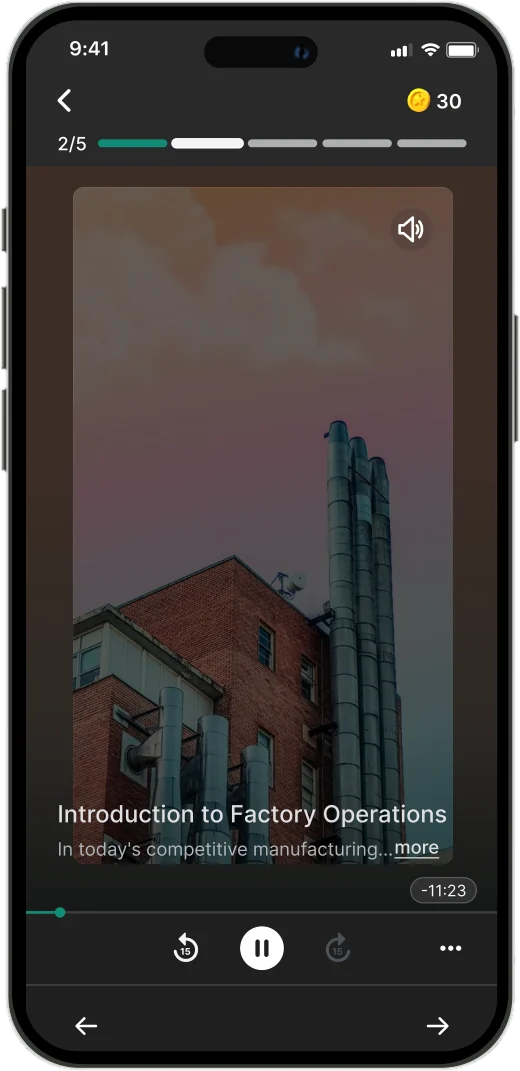
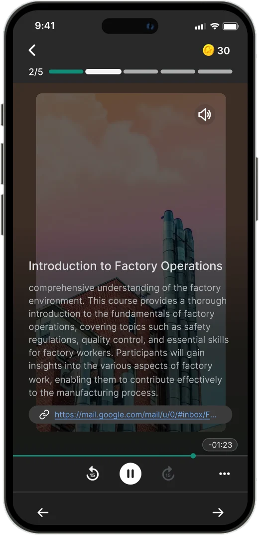
Full-screen video with familiar controls and progress.
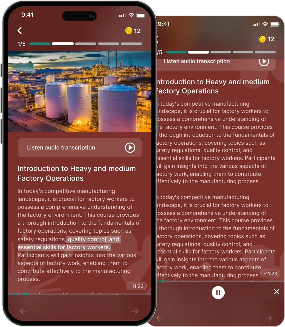
Listen to text-based courses when reading isn't convenient.
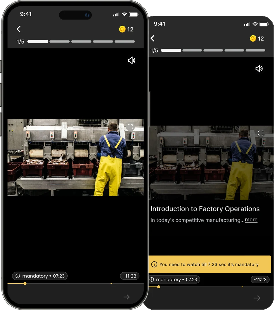
Clear indicators show when a section needs to be watched.
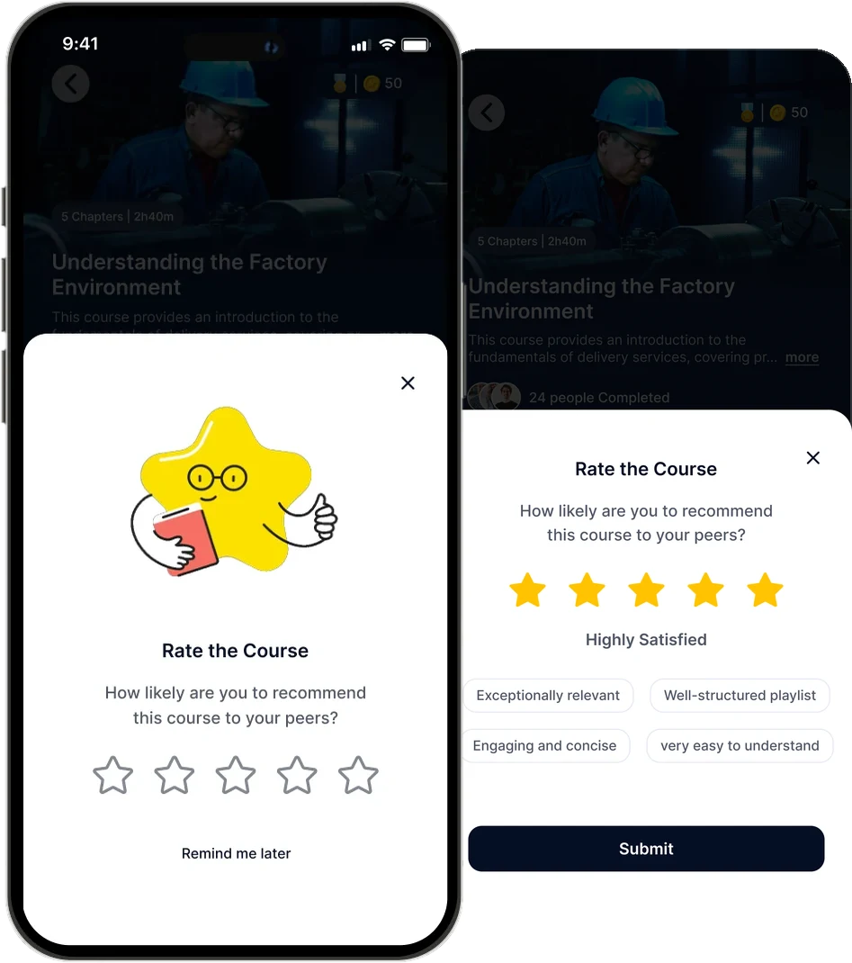
A quick way to rate the course after completion.

We redesigned assessments to make each question clearer, more instructive and more engaging.
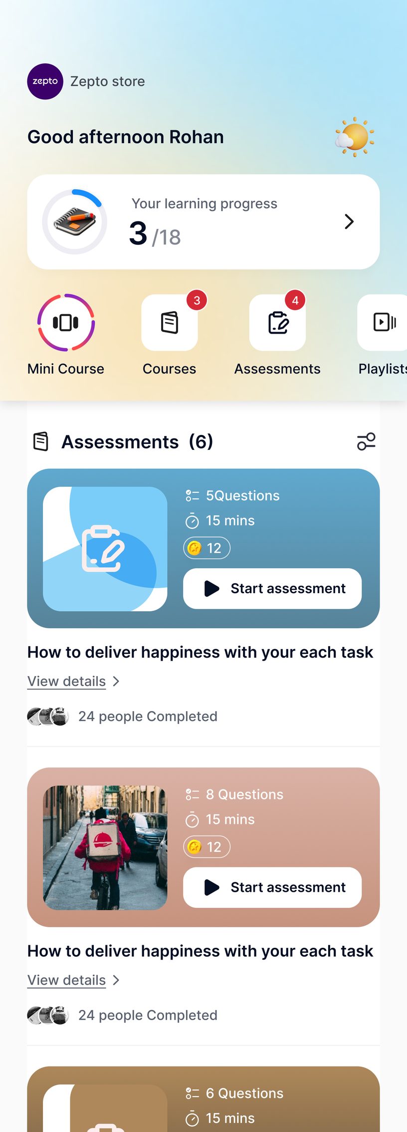
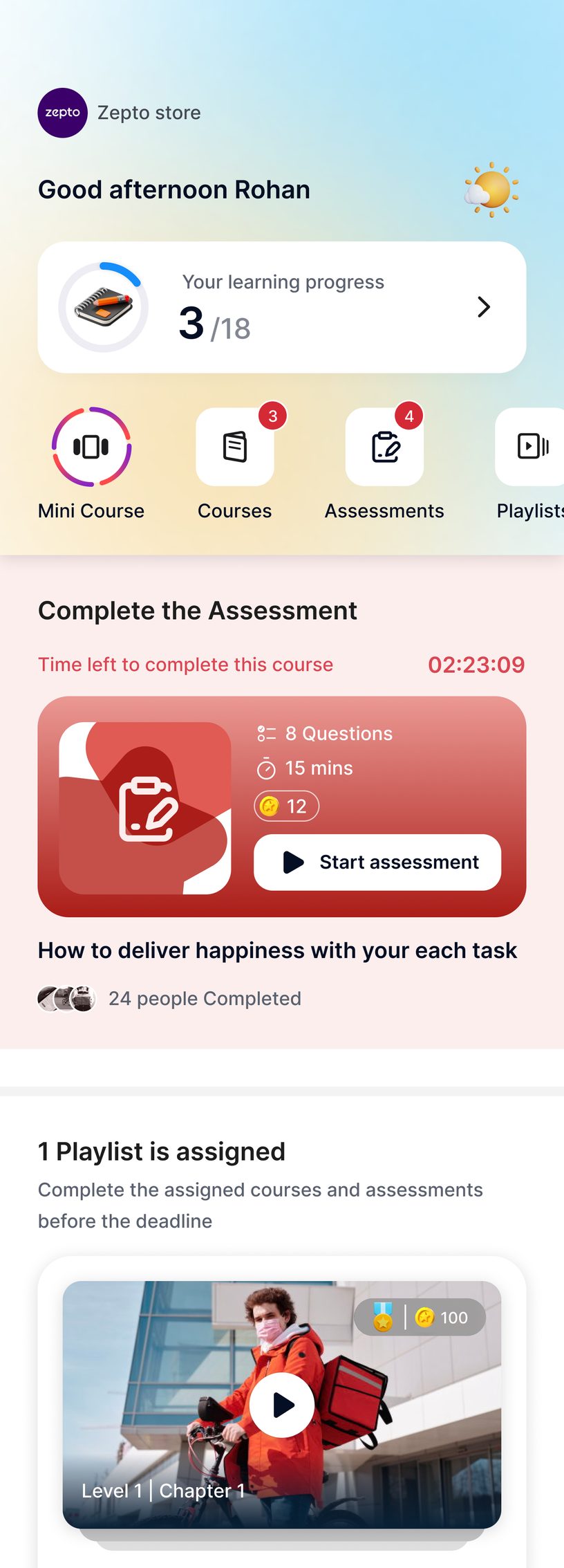
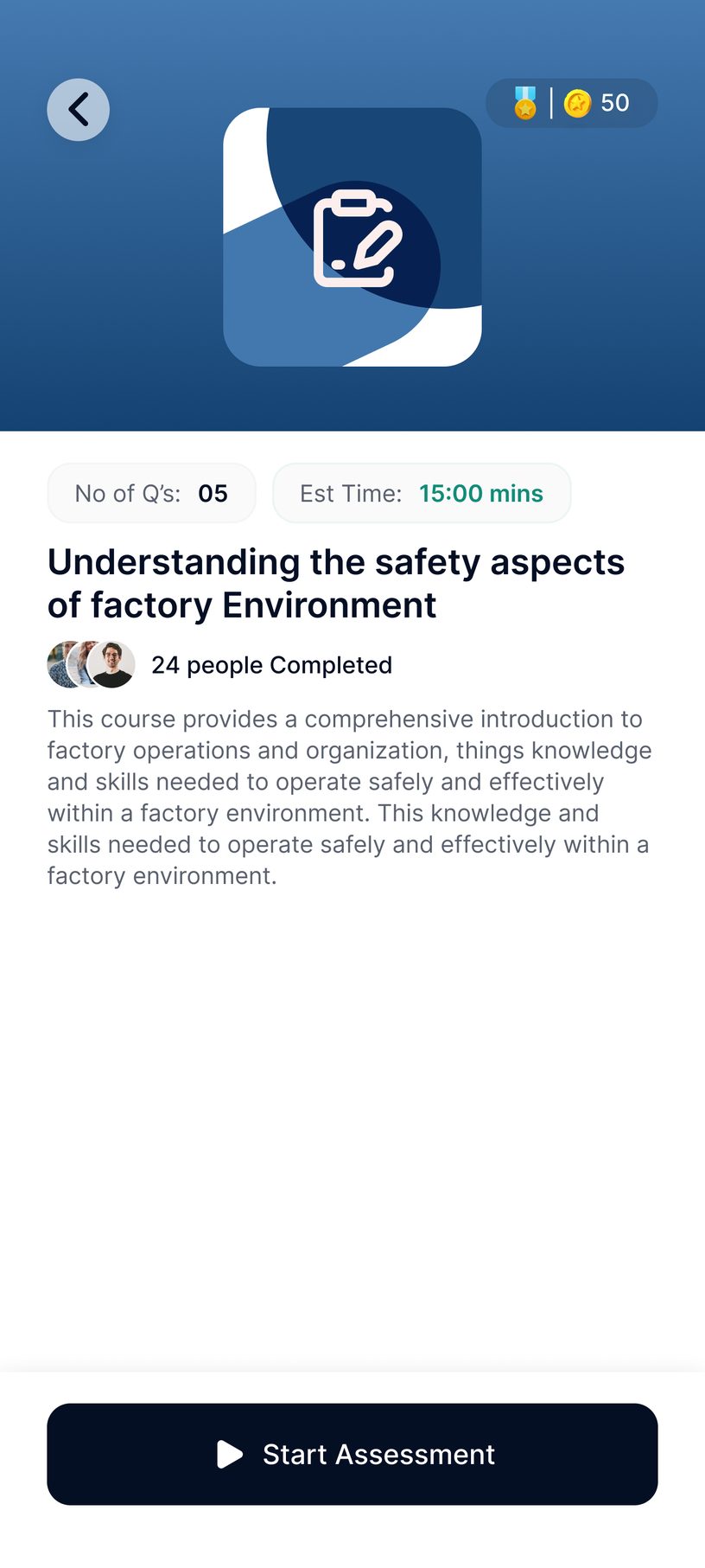
Questions, time and reward sit on the card, so users know the effort before they tap Start.
Anything due soon moves to the top, with a tinted banner and a live countdown to add urgency.
Questions, time needed and how many others have finished it, so users know what to expect.
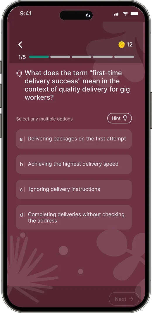
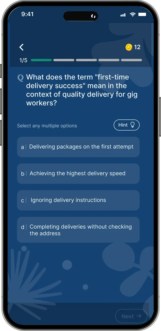
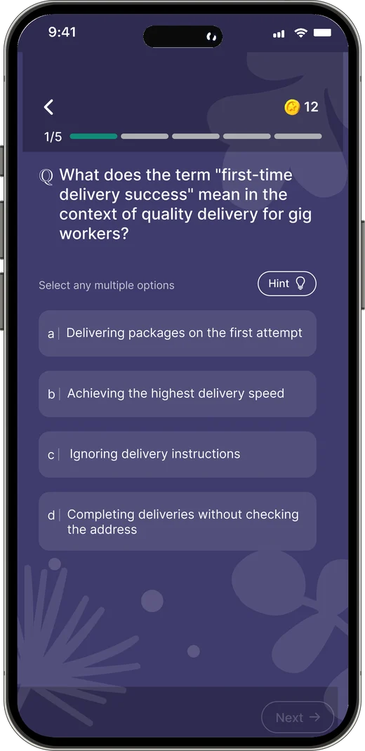
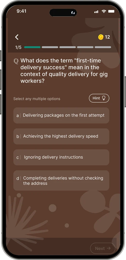
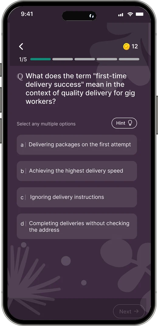
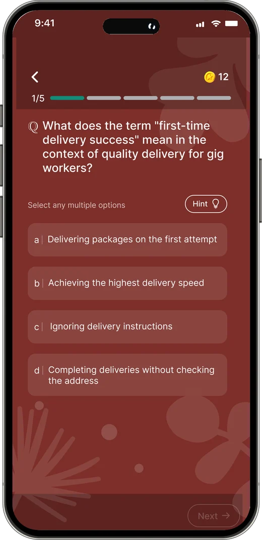
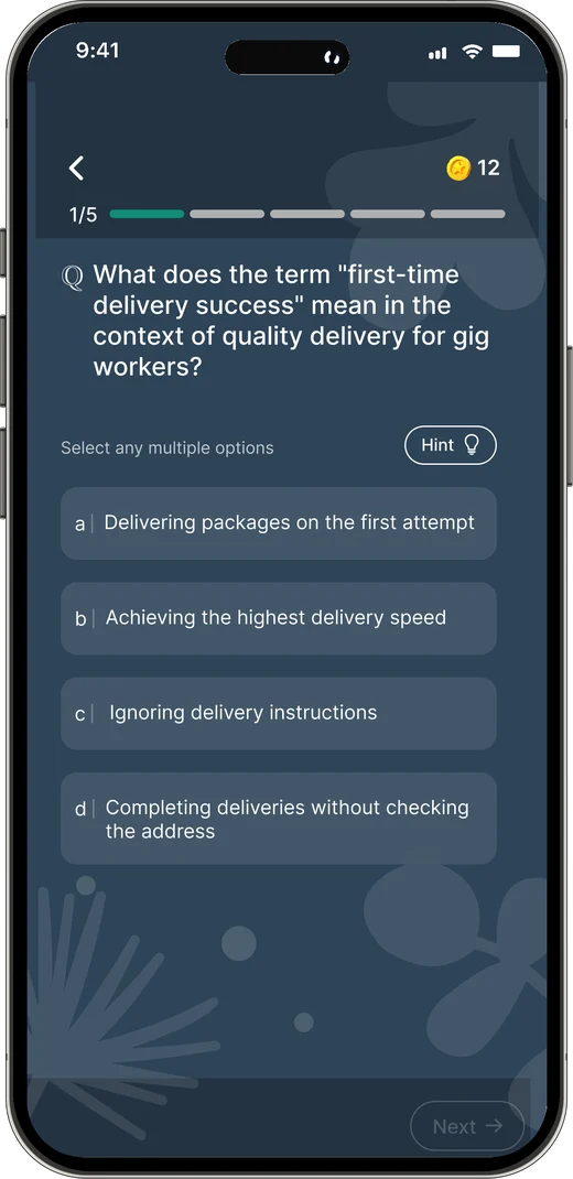
Customisation was a key part of the product, so we redesigned how it could be applied without compromising the learning experience.


How to deliver happiness with your each task
View details
 24 people completed
Pick a brand
Admins choose a colour from the palette and its pattern comes along. The card on home and every question inside take on the brand, while the structure stays exactly the same.
Teal
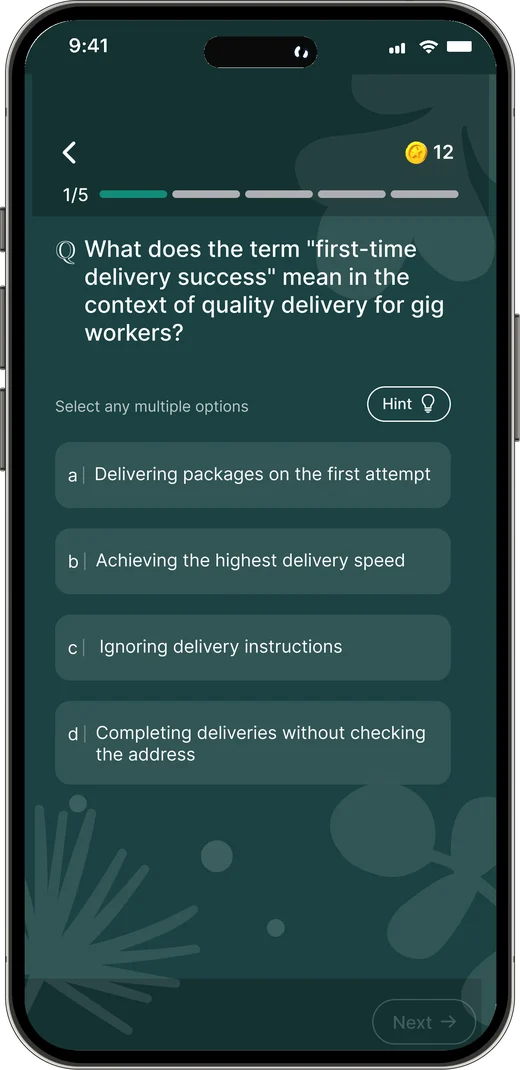
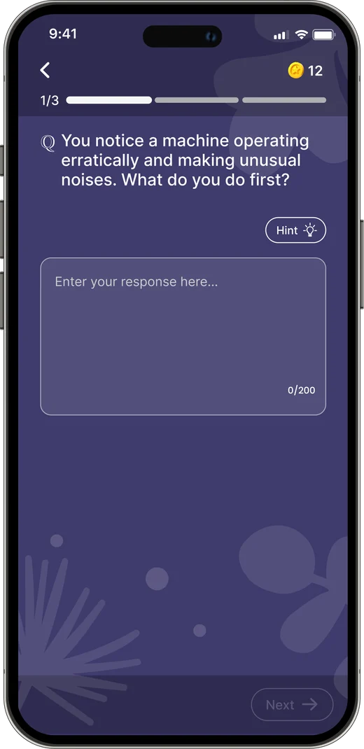
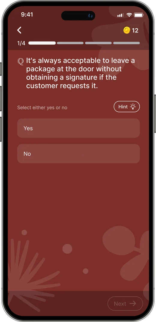
Each assessment supports a full range of question types and captures every response intuitively.
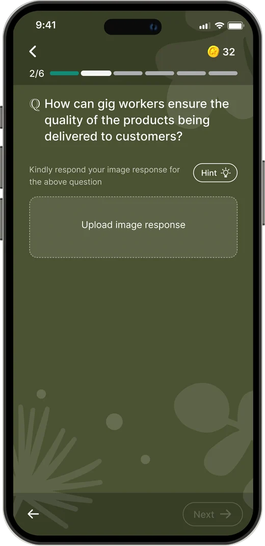
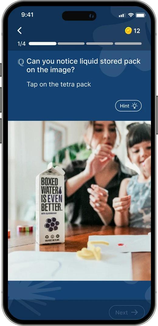
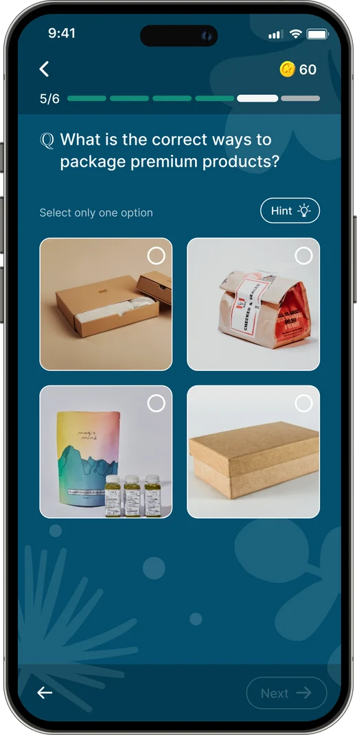
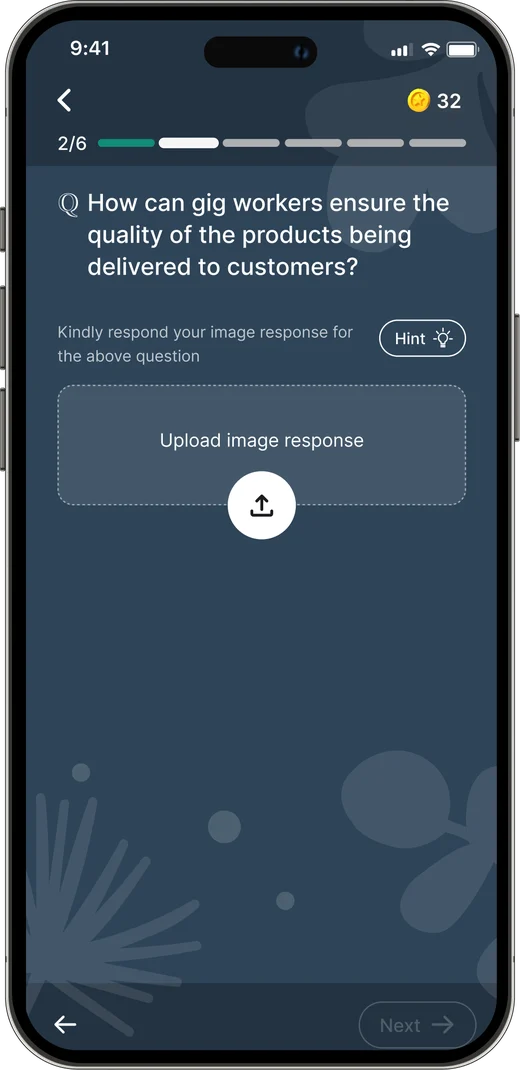
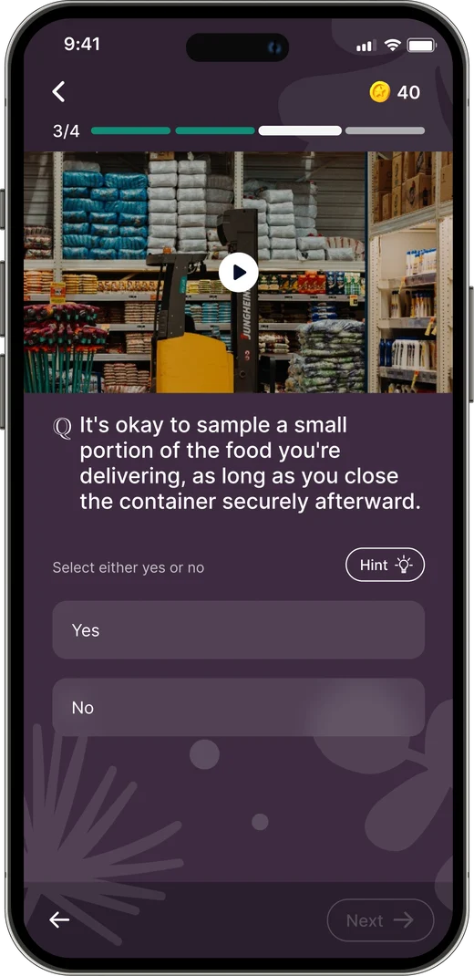
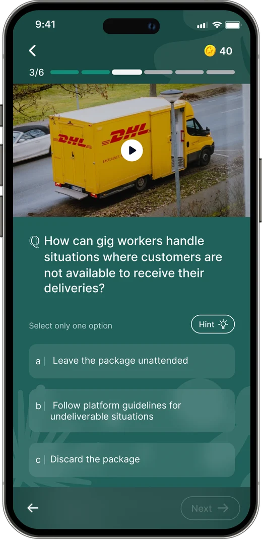
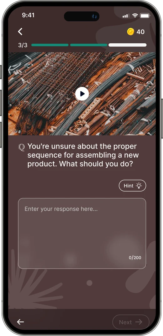
Ways to answer
Questions can ask for an image, a tap on a photo, a pick from options, a yes or no, or a written answer, with or without a video to watch first.
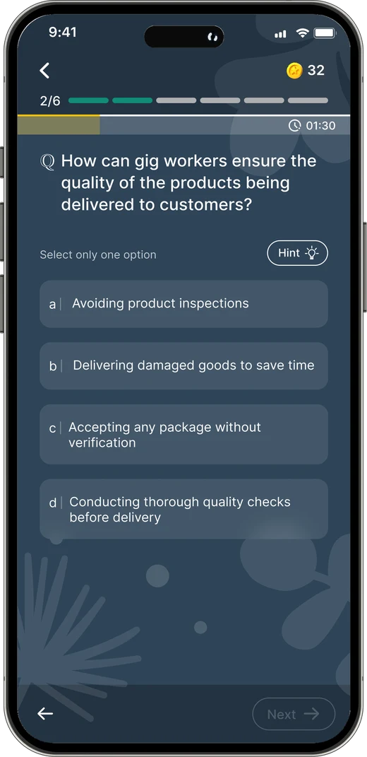
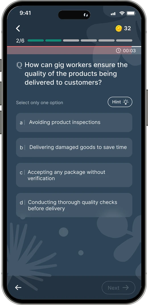
A progress bar shows the remaining time and turns red in the final seconds, making the time limit visible throughout.
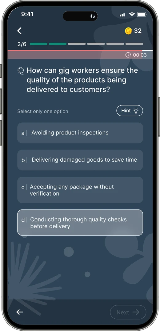
The selected option is highlighted, making it easy for users to confirm their choice before submitting.
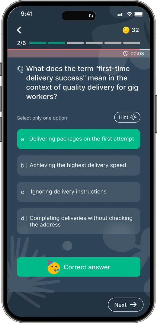
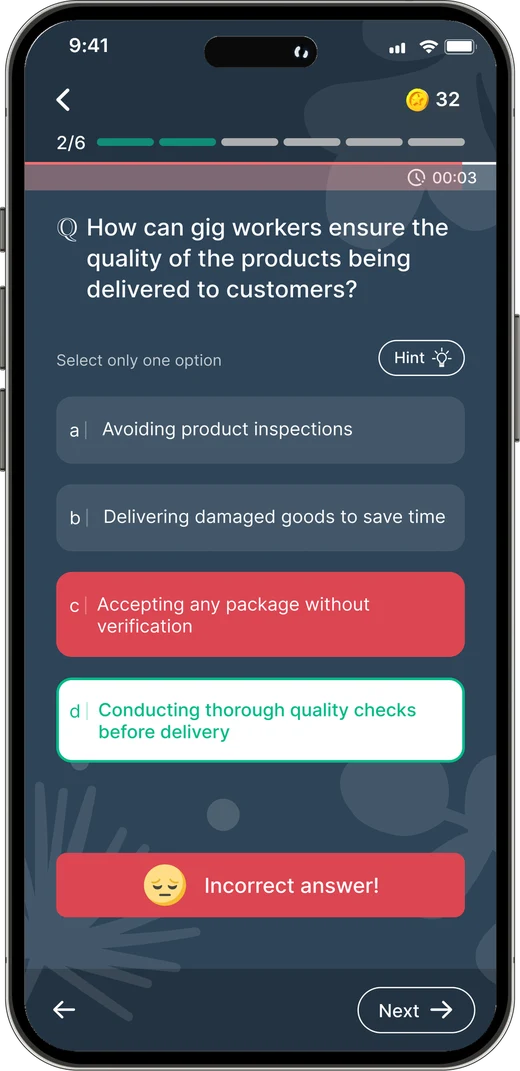
Correct answers turn green. Incorrect answers turn red, with the correct option highlighted so users can learn from their mistakes.
A playlist bundles courses and assessments into levels around a single learning goal. Since playlists can be long, we structured them into smaller, manageable steps.

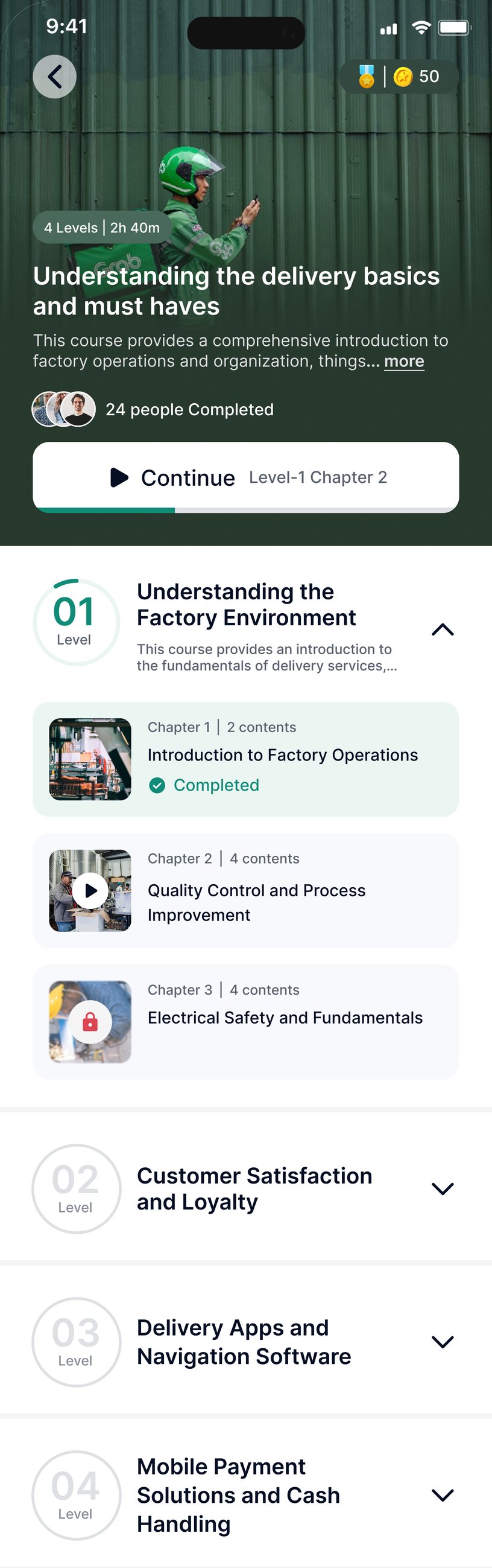
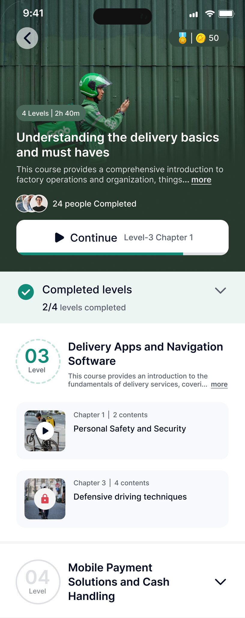
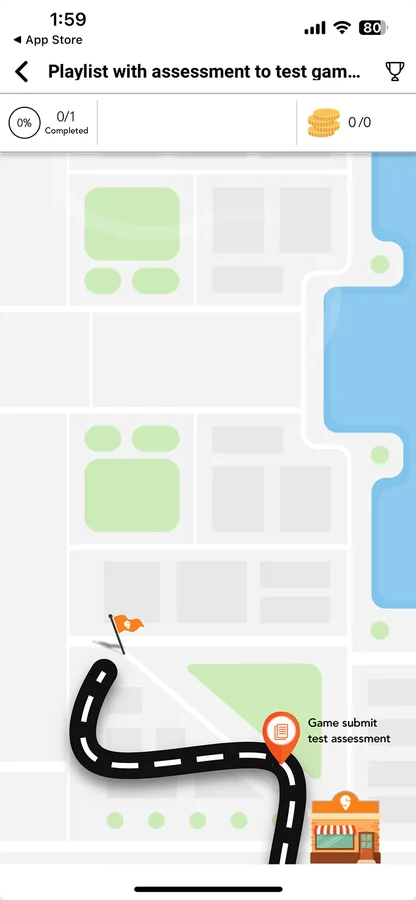
When a playlist opens with an assessment, the card shows its questions and time, with Start playlist right on it.
A playlist with a deadline counts down the time left and shows how many levels are pending and done.
A new playlist opens on its current level, with See all levels to look ahead and one link to every assigned playlist.
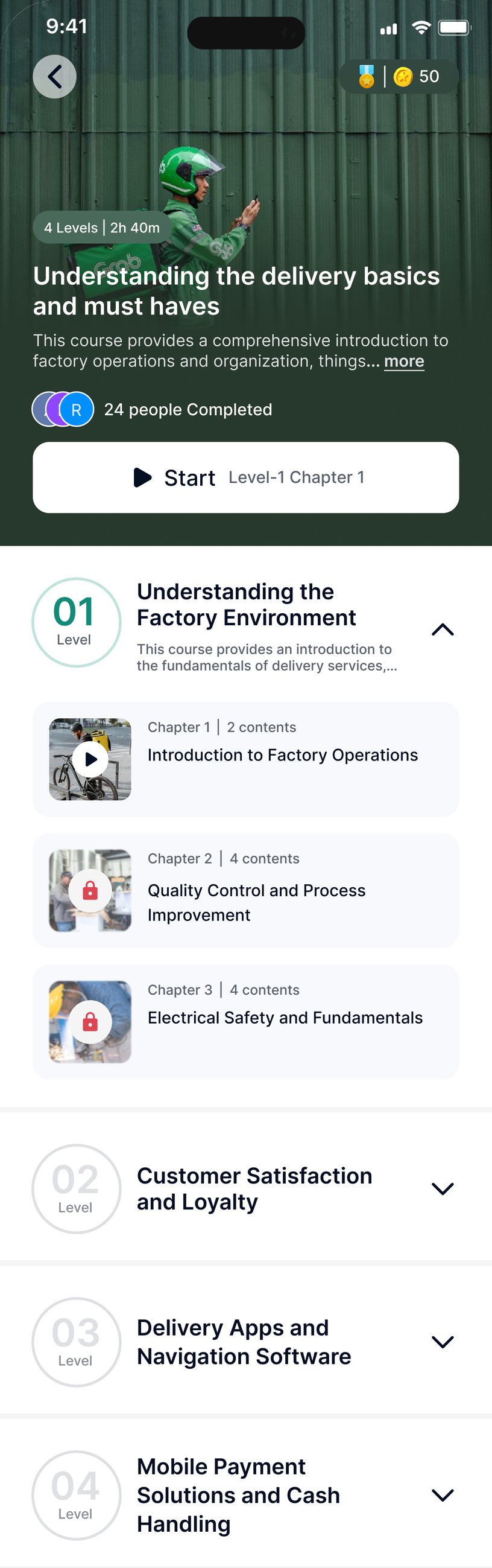
The cover gives a clear overview. Levels are listed in order, and Start names the level and chapter to begin with.
Finished chapters are ticked and the rest stay locked. The CTA turns into Continue and points to the next chapter.
Finished levels collapse into one group with a count and the next level opens, keeping the current one in focus.

My Learning brings everything assigned into one place, with progress upfront and pending modules grouped by type, status, and importance.
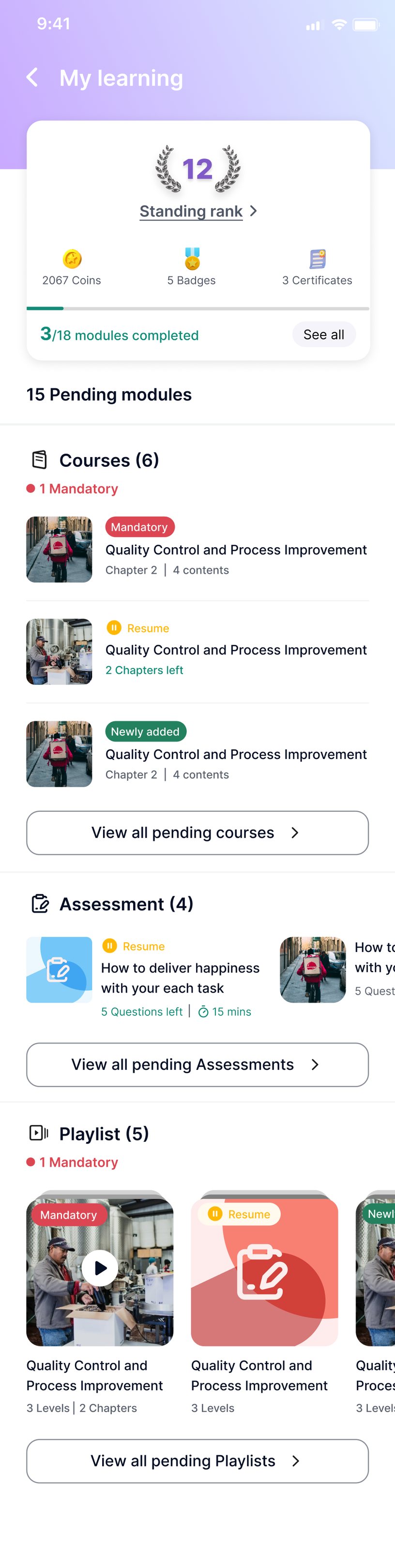
The top of My learning shows standing rank, coins, badges, certificates and how many modules are done.
Pending modules are grouped by type, and each one is labelled as mandatory, to resume or new.
Assessments and playlists follow the same pattern, each with a count and one link to see them all.
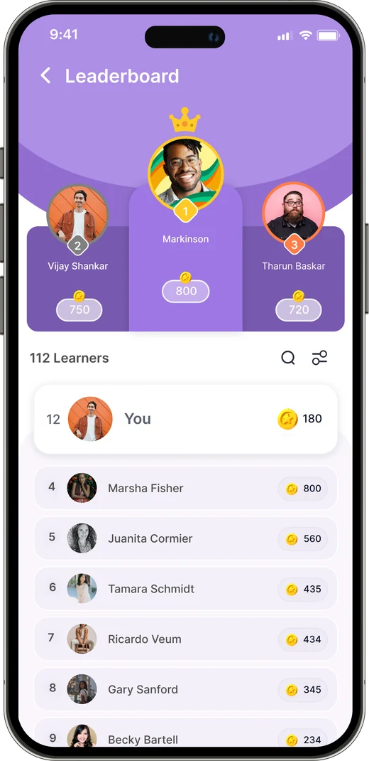
Everyone in the organisation is ranked, which adds healthy competition, and the user's own position stays in view.
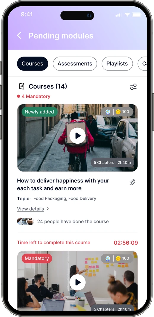
Quick access opens pending modules by type, with tabs to switch between them and a filter for status and criticality.
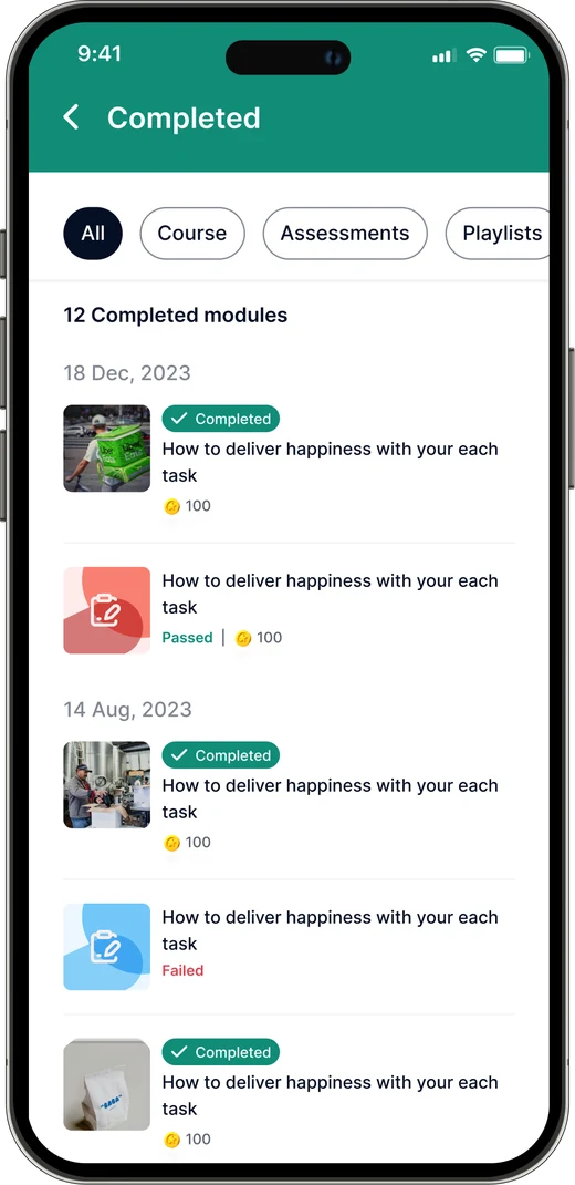
Completed modules are listed by date with their status and rewards, a record of what the user has achieved.
Two more ways to learn: live events that bring instruction into the app, and bite-sized micro-courses designed for shorter moments of learning.
Live classes bring real-time instruction and interaction, in a virtual setting or a physical location. Unlike courses, assessments and playlists, they let trainers and learners interact directly.
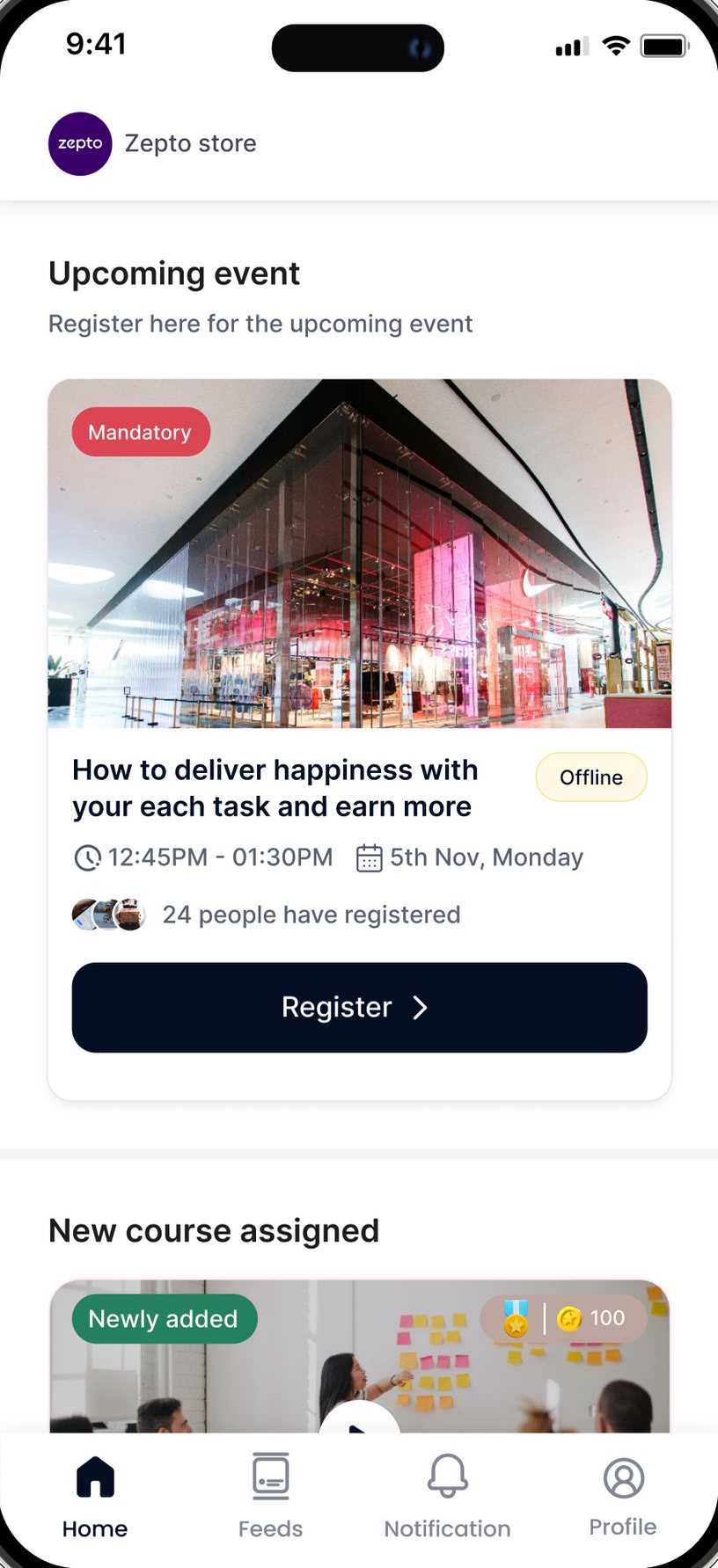
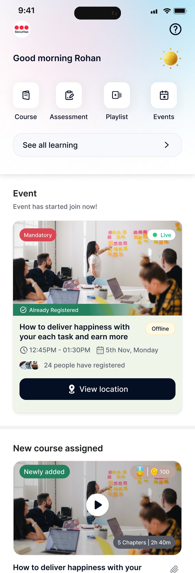
An upcoming event on home shows whether it is mandatory, offline or a webinar, when it runs and who has registered, with Register right on the card.
Once the user has registered and the event starts, the card flags it as live and the CTA turns into View location.
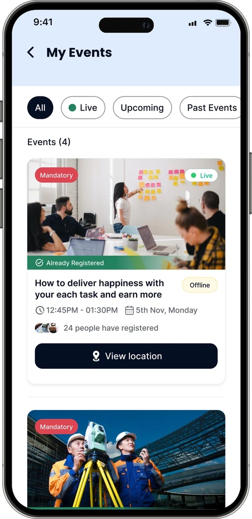
My Events gathers every event with its state, from open for registration to already registered and over.
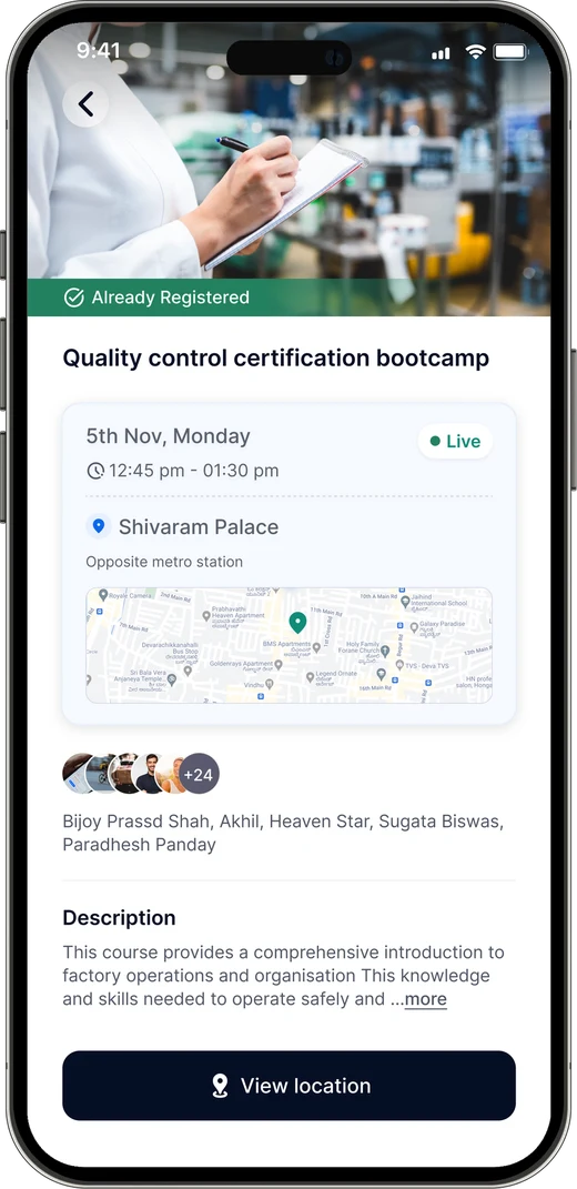
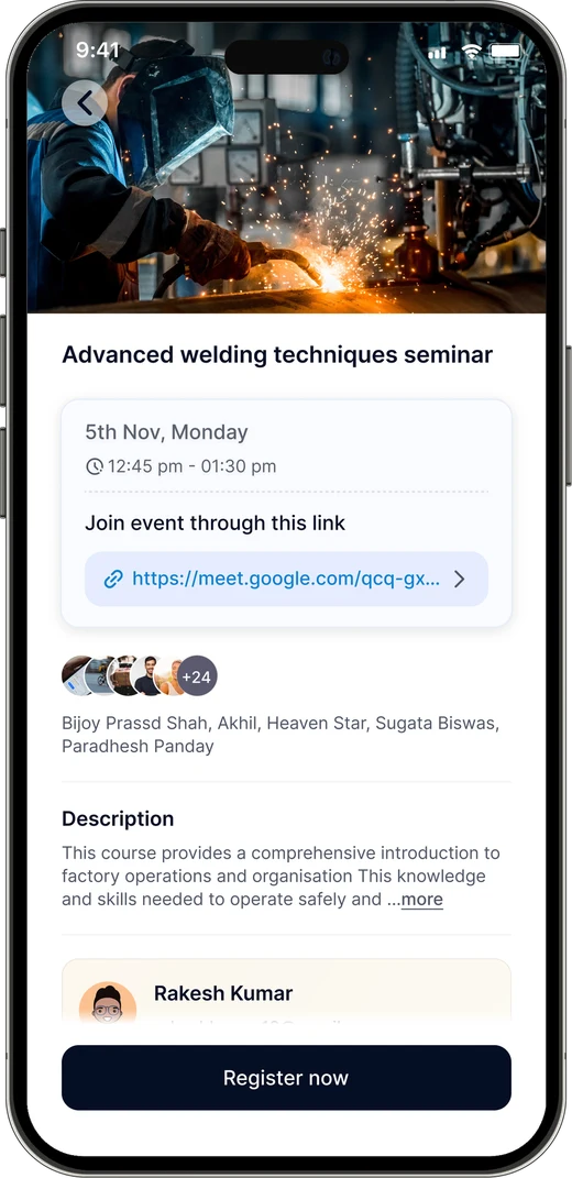
The detail page puts the date, time and venue first, with a map and the trainer's contact. A webinar swaps the venue for a join link.
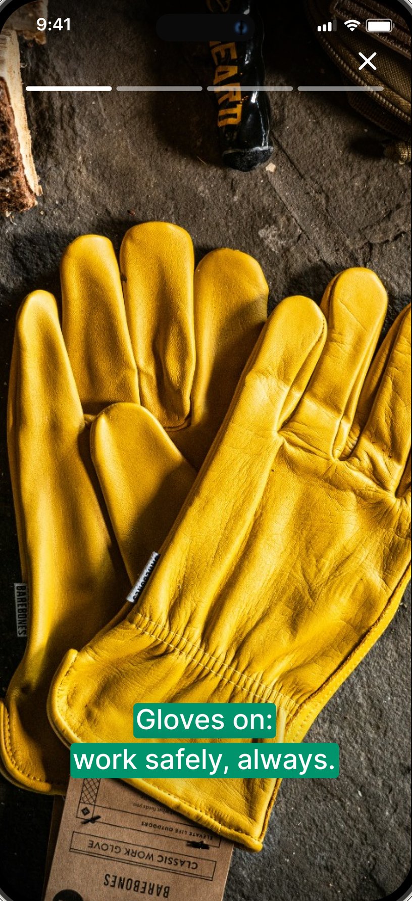
Complex topics are broken into bite-sized slides, with a short quiz at the end to reinforce learning.
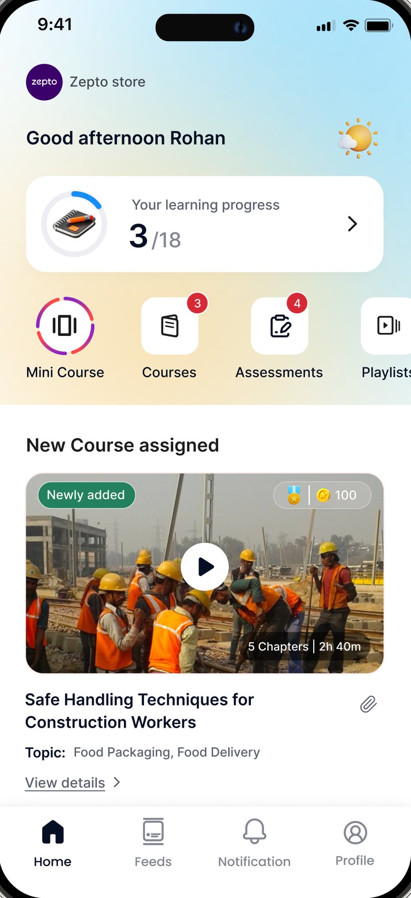
Mini courses sit first in quick access, ringed like a story, so something new is always easy to spot and start.
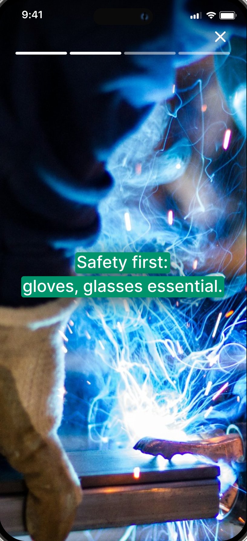
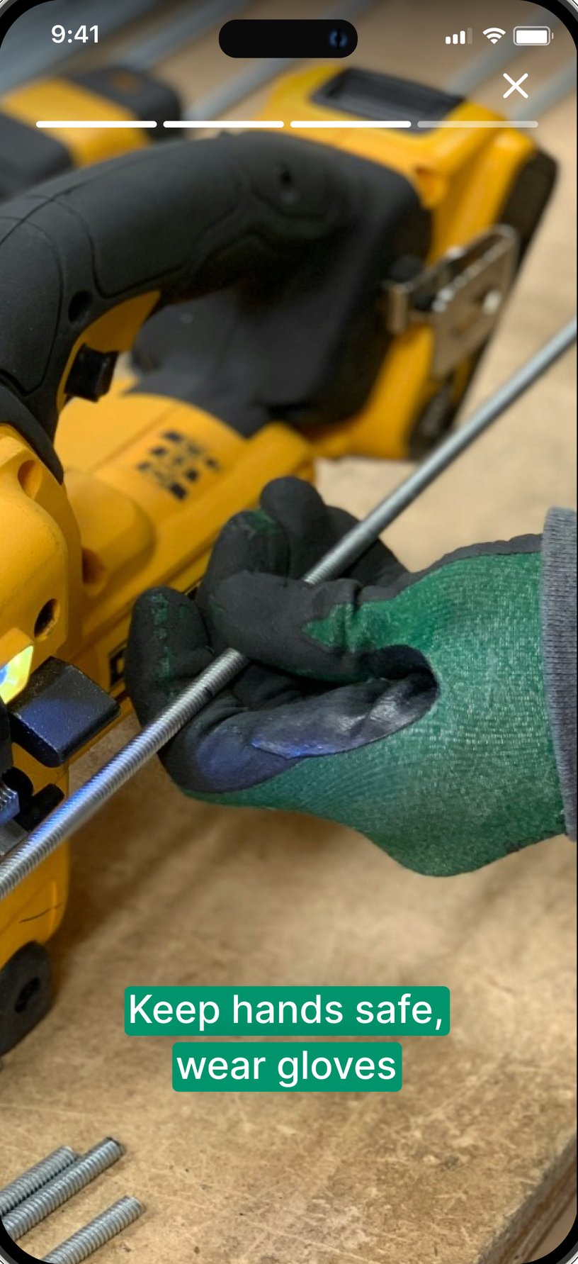
Each slide pairs a full-screen photo with a single short line, and bars at the top show how far along the user is.
Users tap to move on or close at any time, the same way they already use stories on social apps.
A whole course fits in a few slides, short enough to finish between tasks on a shift.
A clearer path from assigned to finish.
Up-skill moved from a catalogue workers had to search through to a guided learning journey.
Thanks for following along.